Role: UX researcher, UI/UX designer
Duration: January 2023 - March 2023
Project Vision
Eco-Stripes is a mobile app and responsive website for a conservation organization that is dedicated to helping different species of tigers. Users can range from young teenagers to retired adults, anyone wanting to learn about and donate to a good cause. Eco-Stripes’ goal is to provide all users with a user-friendly website and app to allow them to easily read about tigers and donate.
Challenges
Provide a quick & streamlined donation process
Create an accessible and fun information page for users
Design a consistent user interface across all platforms
User Research
I started by conducting several interviews and creating empathy maps to understand the users I’m designing for and their needs. I focused on a few key questions such as: Who is our primary user? What goals do they have? Why would someone want to use this website? Would users choose to use the mobile app or website? After interviewing five participants, it was evident that many users had similar goals; being able to easily navigate and complete the donation process on any device, whether on a desktop or mobile app.
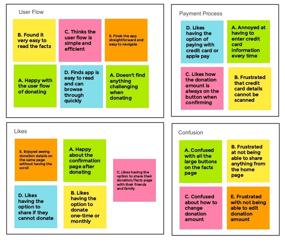
The interviews conducted gave me a better understanding of the navigation and usability of the app and website in its early design stages. I created an affinity diagram to help develop actionable insights for future design improvements.
AFFINITY DIAGRAM
Meet the Users
Name: Jessica
Age: 65
Occupation: Retired
Jessica is a retired teacher who loves to spend her free time volunteering and helping at animal shelters and other non-profit organizations in her hometown. However, she wants to make a bigger impact and try to help animals all around the world. Since she isn’t a tech savvy person, she often has trouble navigating through animal donation websites to read about and donate to help endangered species. Jessica would also prefer if the website had something to help her read since her eyesight is getting worse.
Name: Trevor
Age: 22
Occupation: Wildlife Biologist Student
Trevor loves animals and is studying to become a wildlife biologist. During his commute to school and work, he often goes on his phone to read up on different animal species and their status in the ecosystem. He would love to be able to easily donate to help endangered animals using his mobile phone while on the go. However, Trevor is very clumsy and forgetful and often misplaces his wallet. He wants to help save animals whenever he can but his forgetfulness can get in the way.
Competitive Audit
I completed a competitive audit to compare the design, browsing, and donating experience of both direct and indirect competitors’ apps/websites. After identifying the strengths and weaknesses of each competitor, I was able to revise the design of Eco-Stripes’ mobile app and website to enhance the user experience.
The majority of the features between competitors were similar, however, there were some opportunities I observed that could be applied to the Eco-Stripes app and website, such as:
Providing audio versions or screen readers
Providing instructions on how donations work
Providing different language options
Clearly label buttons and icons.
Mobile App
Lo-Fi Ideation
For this project, I used a mobile-first approach. By sketching out some preliminary paper wireframes for the mobile app, I was able to identify any ideas or layouts that wouldn’t work well. Sketching ideas out on paper allowed me to focus on addressing the user pain points.
Preliminary Wireframes
As I moved from paper to digital wireframes, it was easier to see if my designs could address user pain points and improve the user experience. Prioritizing clear labels and useful button locations on the homepage was one of the strategies to make navigation easier for users. It was important for me to start small and scale up so that I could focus on ensuring the app had all the necessary features before expanding on more ideas and details on the larger website versions.
Iteration
After conducting another round of usability studies for the low-fidelity prototype, I was able to receive valuable feedback to further refine the design. Many users had similar frustrations with the button labels, font sizes, and general navigation of the homepage. I made sure to address these concerns in the high-fidelity mockups.
Changing the label on the button minimized any confusion in how to complete the donation
The layout of the homepage was changed so users can read more about the topic first before proceeding to the donation page
Quick & Streamlined Donation Process
Challenge 1
Several features were added to ensure the donation process is simple and quick for all users to complete. With the ability to scan your credit card information, it gives users another option to fill in their information without having to type.
Users can also easily toggle the button to securely save their credit card information for future uses, which can encourage users to come back to the app and donate with ease.
Accessible and Fun Information Page
Challenge 2
Accessibility should always be considered as it can encourage more users to explore the app. The audio feature can allow users with any range of disabilities to have the resources to easily navigate and donate on the app.
Fun images, icons, typography, and colour are used to keep users engaged and wanting to read more.
Challenge 3
A Recognizable Product
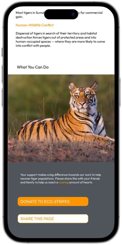
With Eco-Stripes’ mobile app and responsive website, it is important to keep the design and function consistent across all platforms so users can continue to have a smooth and seamless transition between any device they use. The same colours, typography, and icons are used so users will have familiarity on any screen size.
Responsive Website
Information Architecture
After designing the mobile app, I started working on designs for the responsive website. The confusing donation process was a primary pain point for users, so I used that knowledge to create a sitemap.
My goal here was to make strategic information architecture decisions that would allow users to go through the donation process easily. The structure I chose was designed to make things user friendly and simple.
Wireframes + Mockups
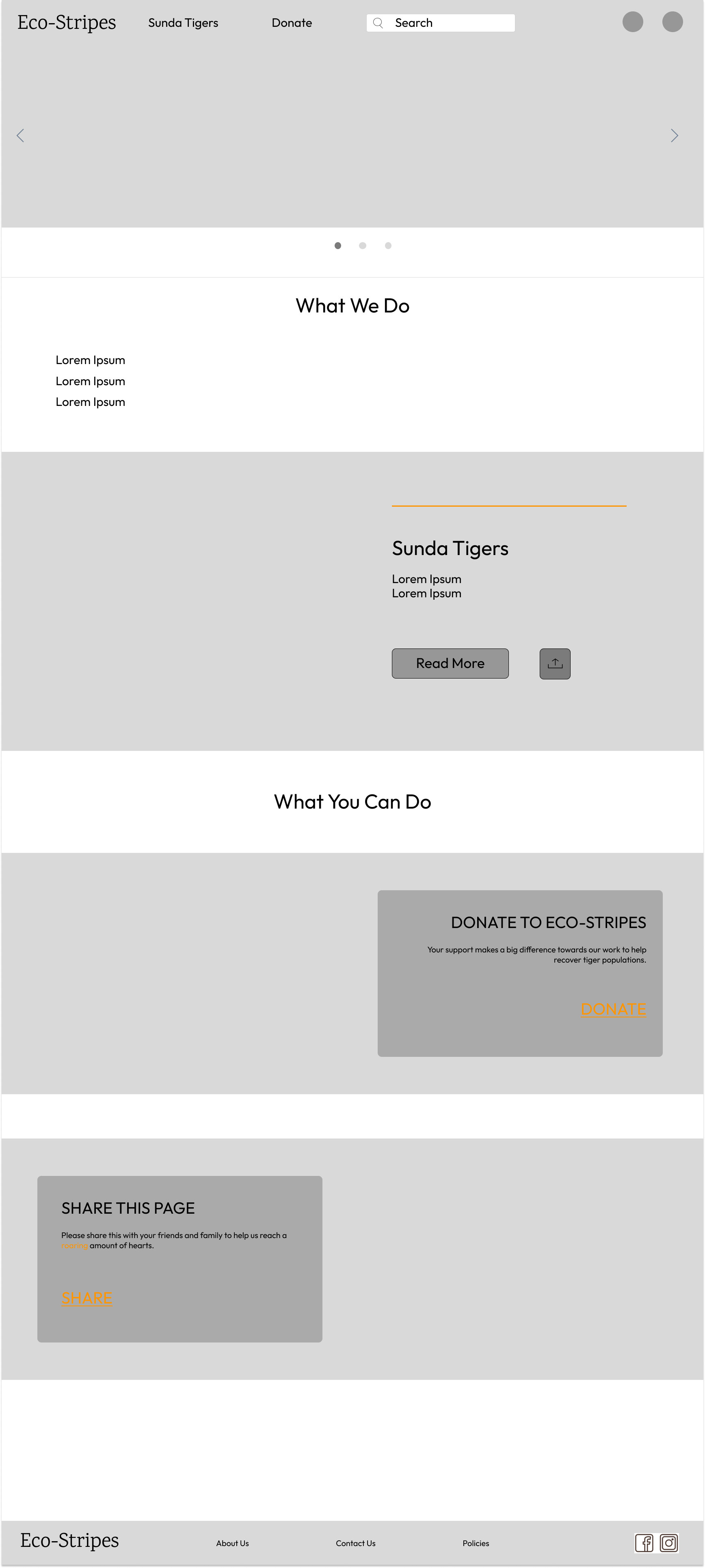
The designs for screen size variation included mobile, tablet, and desktop. Users read from a variety of devices so it was important to optimize the reading and donating experience for a range of devices sizes.
In the mockups, I optimized the designs to fit specific user needs while still maintaining consistency across each device and screen size. This can ensure users have a smooth experience navigating the website, whether on a large desktop screen or a small mobile device.
Mobile
Mobile
Tablet
Tablet
Desktop
Desktop
Final Designs
Audio feature pops up when users hover over the button and can be turned on or off
The same colours, typography, and icons are used so users will have familiarity on any screen size.
Social media icons are added on larger screen sizes for users to easily share the page
Style Guide
Different shades of orange were used along with black, grey, and white to mimic the look of a tiger. This helped to establish the branding of the app and website and allowed users to have a better connection to tigers visually. The bright and vibrant oranges are fun colours that can uplift people’s moods and potentially encourage users to support.
Takeaways
The Eco-Stripes app and website was an idea I had after reading about endangered animals needing our help. After asking friends and family if they knew about this issue and if they ever considered donating, it surprised me to find out very few even knew about this cause. I recognized there may have been a problem with the current animal donation websites if not many people knew about it or felt the need to donate. That’s when I started researching potential pain points that were causing users to not visit the site or not wanting to donate.
Although this project was based on tigers, the ideas and concepts developed here could be applied to any kind of species or any donation process in general. I wanted to design an app and website that made it easier and more accessible to help others in need. Through my usability studies, I discovered that people will feel more encouraged to donate and help protect endangered animals if the process is easy, familiar, and reliable.
While designing the Eco-Stripes app, I learned that small design changes can have a huge impact on the user experience. It’s important to diligently go through each step of the design process and focus on the feedback from usability studies to come up with design solutions that are both feasible and useful.


